I love their minimal, clean design and over-involved production. The understated layout relies on the production process to convey a sense of high quality. It doesn’t try to over-sell itself using printed images. Its character is in the texture and finish of what it’s made out of. You can feel the texture of the uncoated paper. They’re twice as thick, so they don’t bend. You can see and feel the beveled edges of the imprint left by the steel plates. These are all those minor details that don’t jump out at you right away but somehow leaves an impression. Kind of like when you open an Apple product, vs. opening an electric drill from a hardware store. You can tell, there’s something different.
My Old Card
With a new name and URL, my old business cards have been retired. Although I’ve got new ones, which look almost identical, I still look back at the originals, beaming with pride.
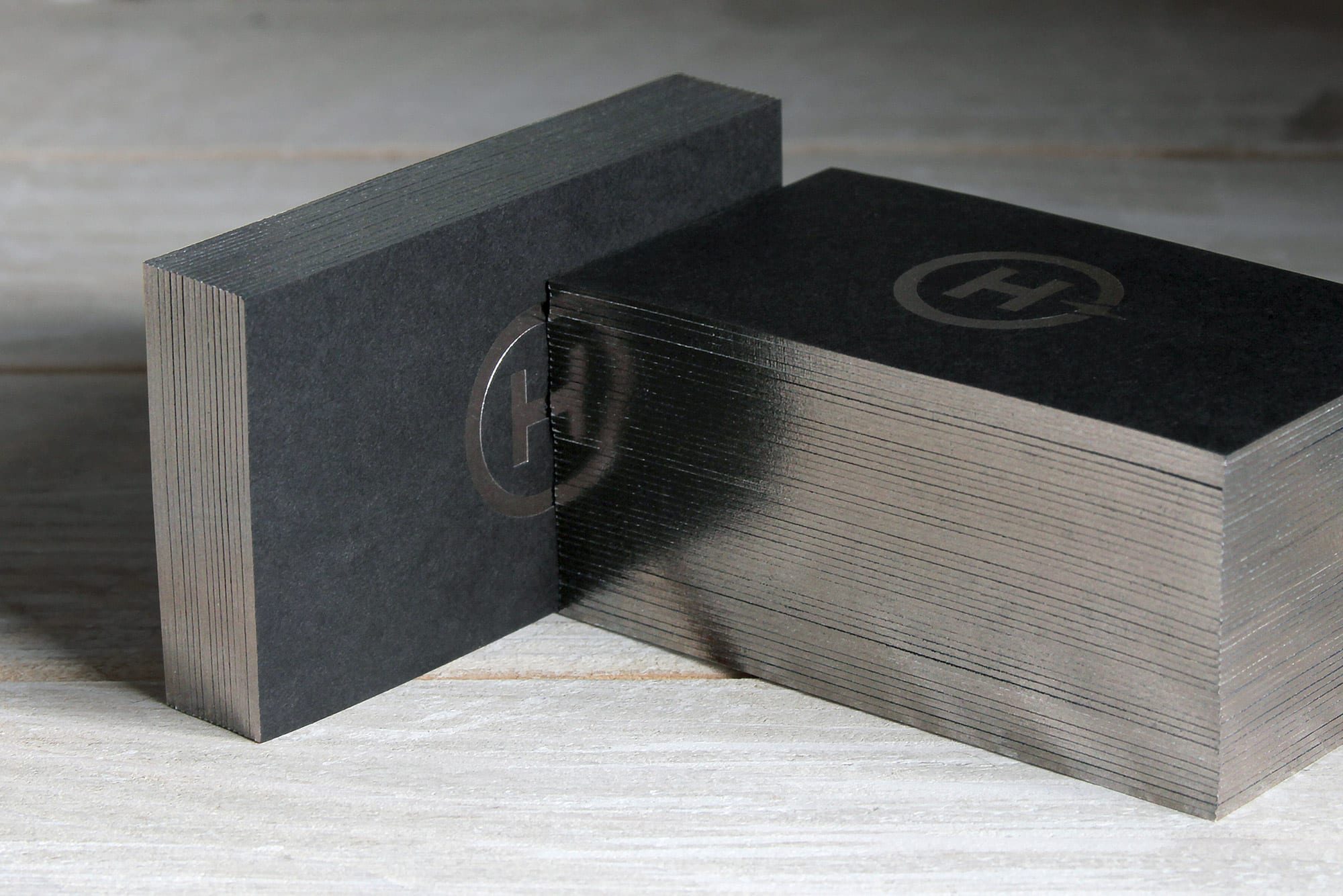
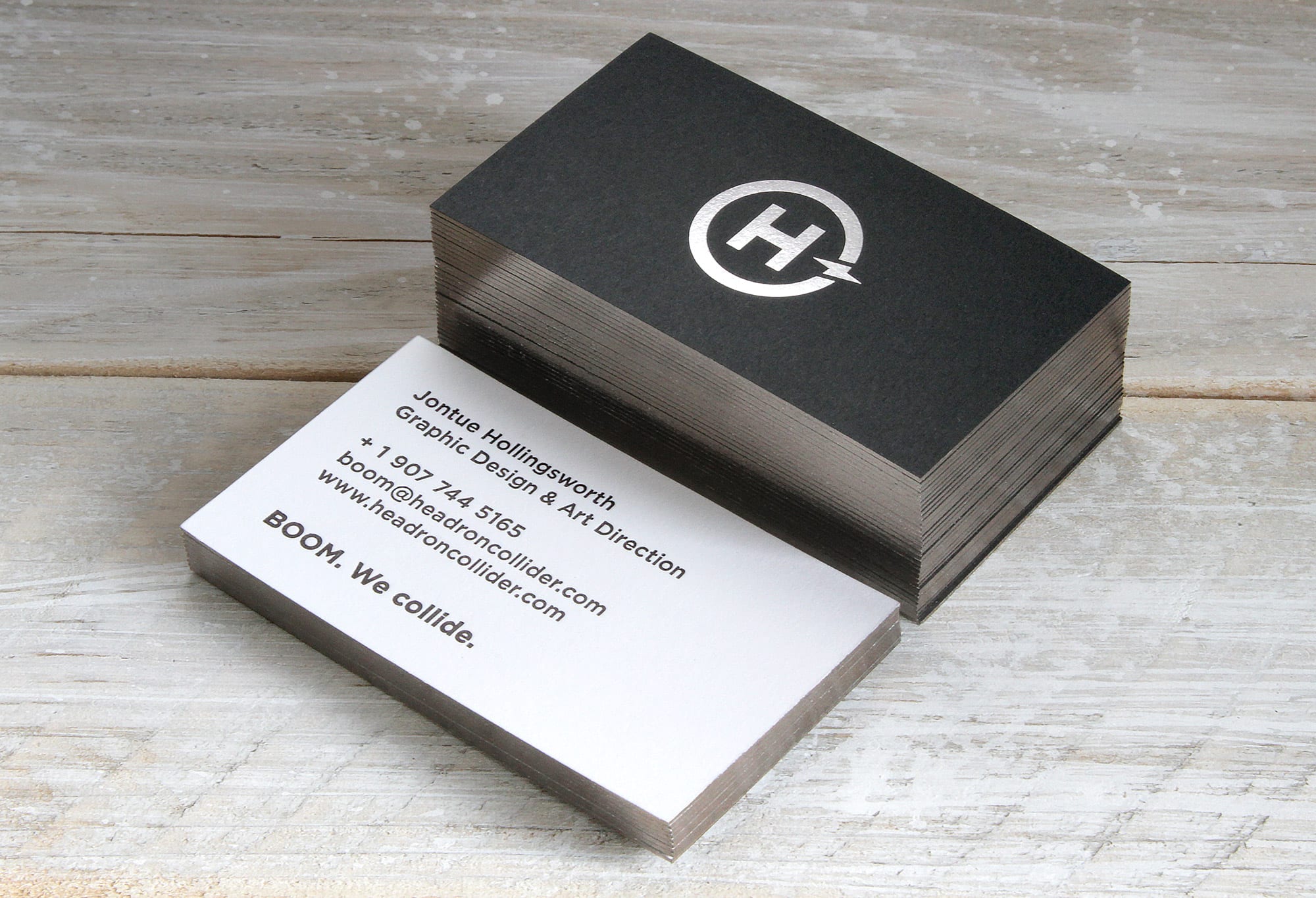
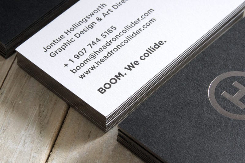
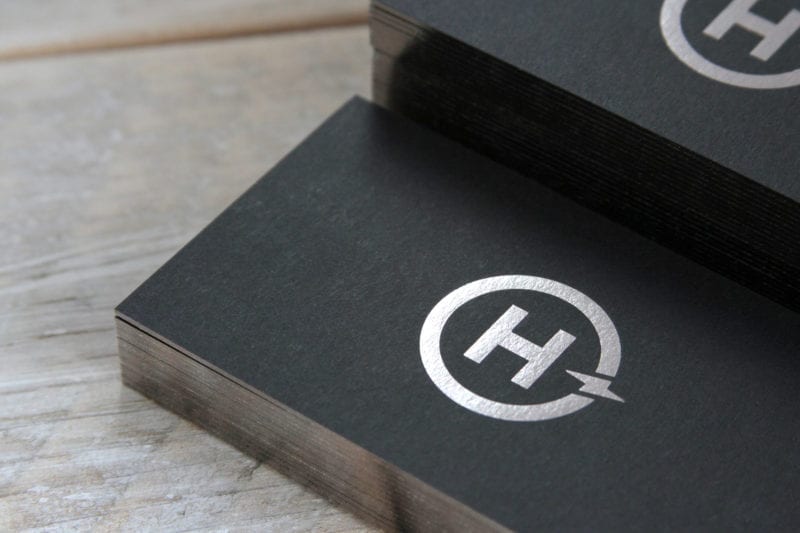
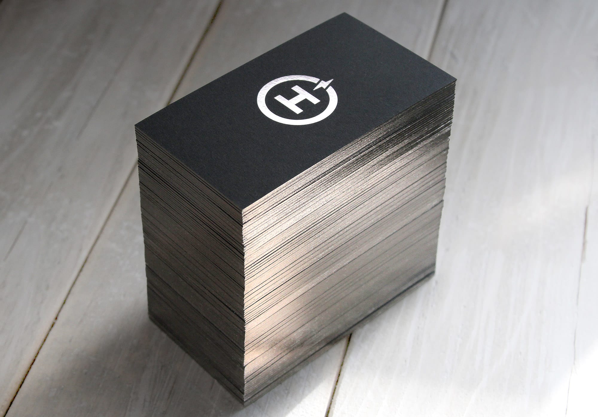
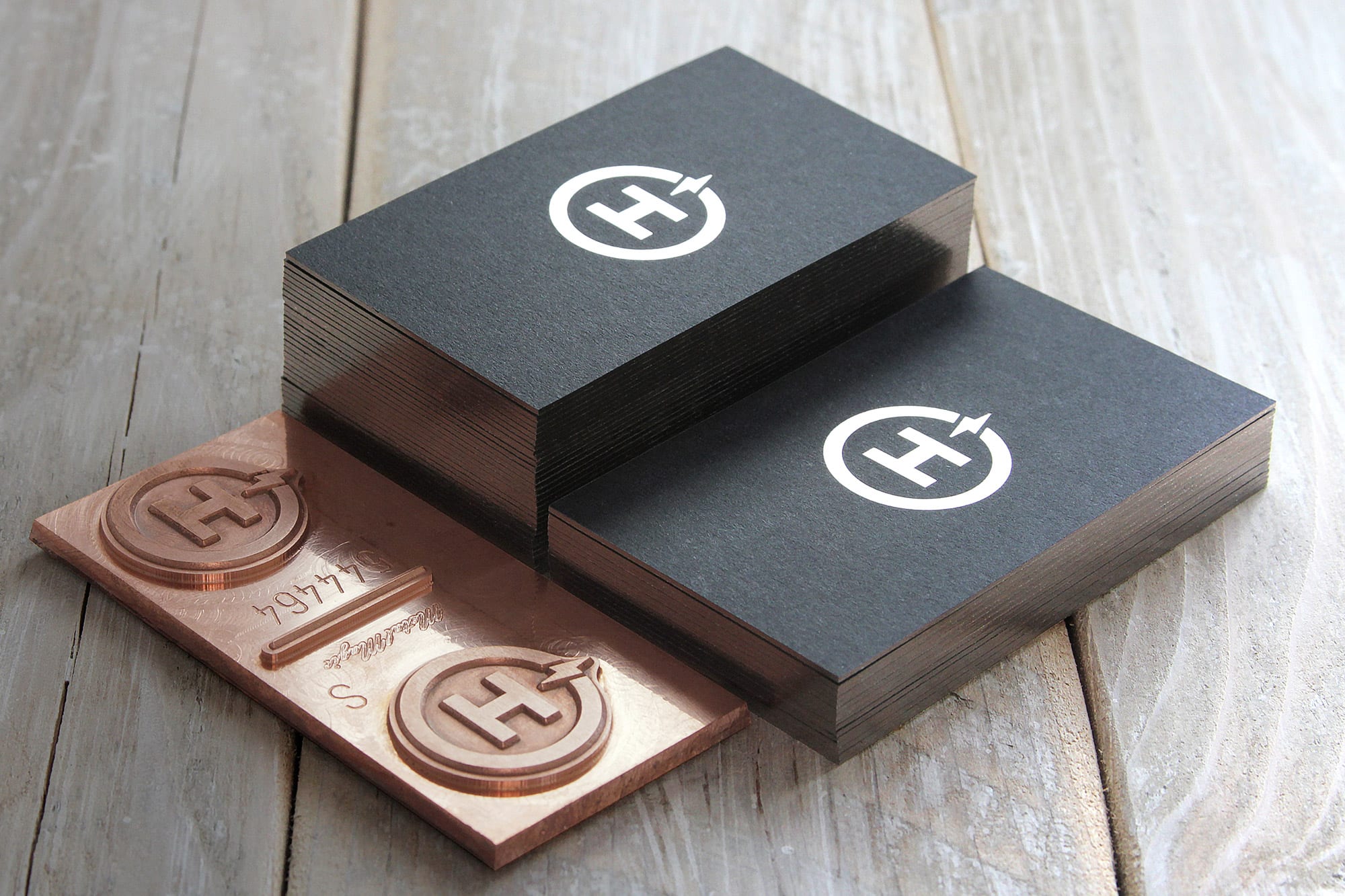
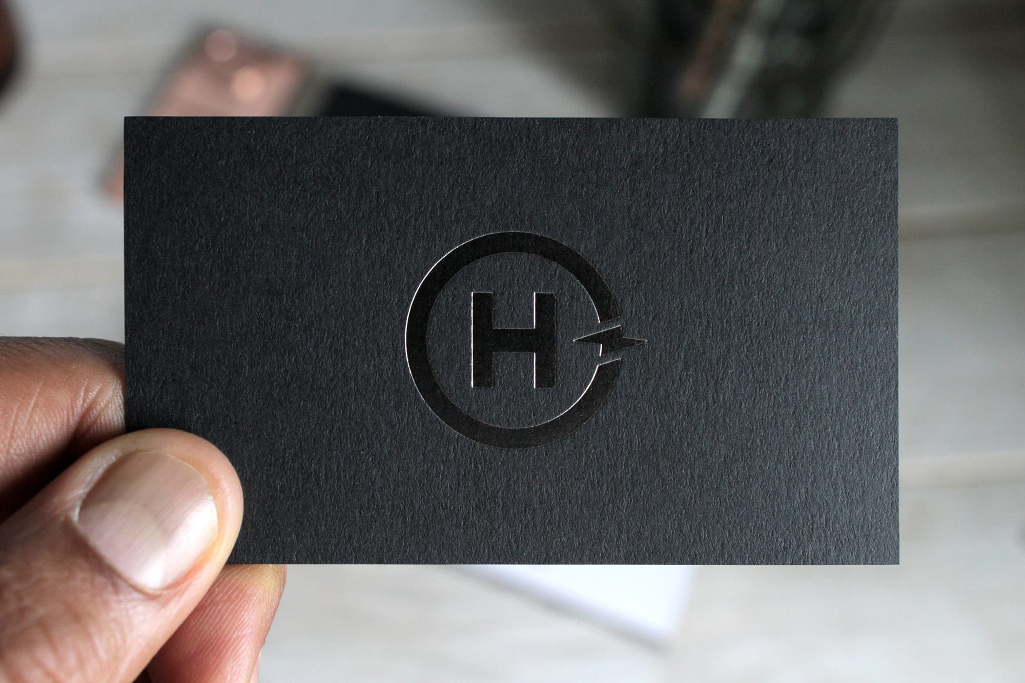
The layout is deliberately minimal. It’s clean and straightforward: a logo on one side with contact info set in bold and medium weight Gotham on the other. This card is made of two different papers: 130# Strathmore Cover, Midnight Black Wove and 130# Superfine Cover, Ultrawhite Eggshell. The white paper is letterpressed with black ink, while the black paper is hot foil stamped in gunmetal gray. The two are then duplexed together, leaving a noticeable layered edge. The edges are gilded with gunmetal foil to hide the seam and to add a metallic pop.
I know I’m sounding like that scene in American Psycho, but hey, I wouldn’t be a good designer if I didn’t pay attention to this stuff.
By the way, these were produced by Publicide Inc. Not an online, digital, bargain business card printer, but an actual brick and mortar with heavy machines made of metal, gears, and levers, operated by talented craftsmen that know their shit.