My childhood was filled with the great superhero fantasies of the 80’s. This eventually grew into a comic book fascination that continues to this day. It’s always extra special to work on a project with some personal interest.

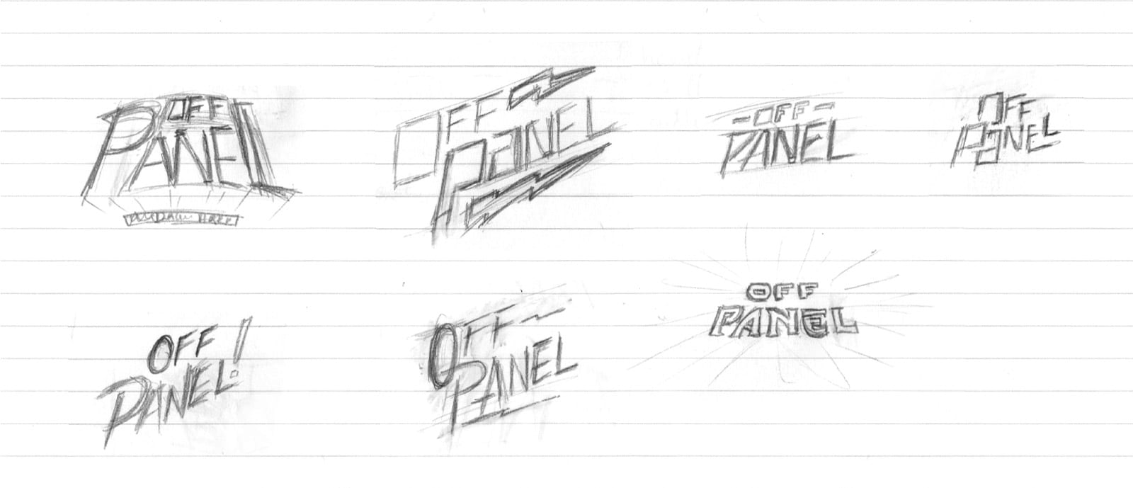
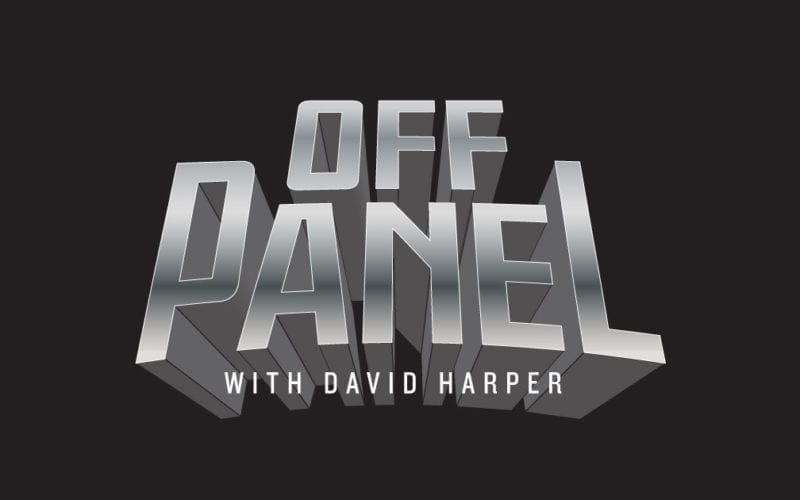
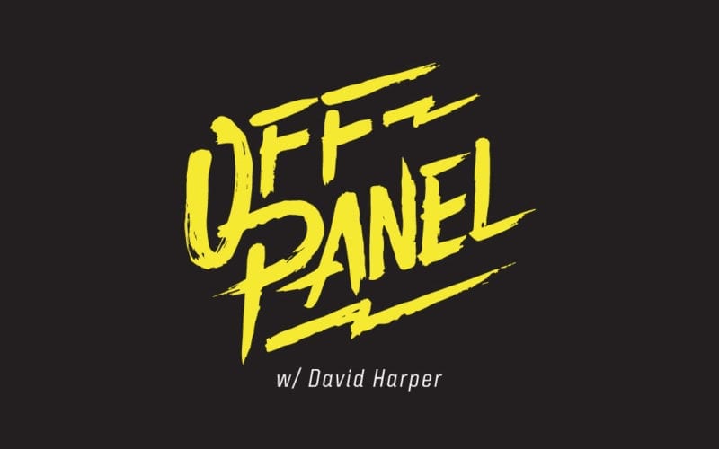
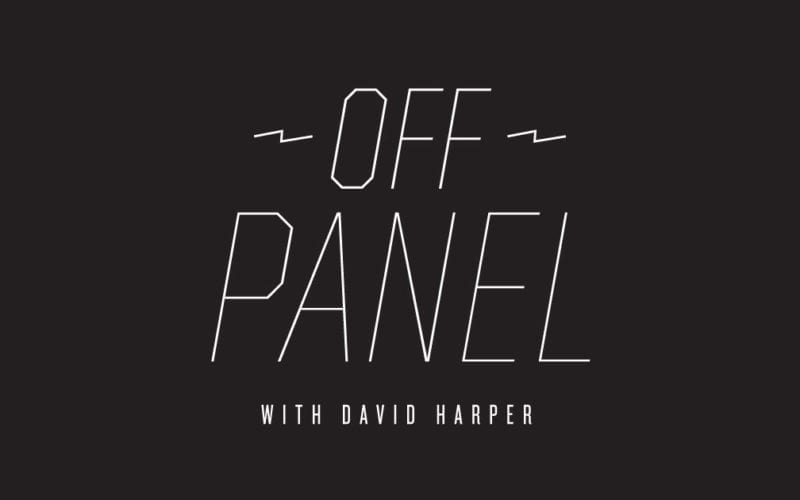
Years ago, David Harper and I were coworkers at an ad agency. His side hustle was a comic book podcast called “Off Panel.” Even though we never really worked together much, we did have our fair share of nerdy conversations, which, most of the time ended with me receiving quite an education. So, I was excited when David approached looking for some help with a new logo for the podcast.

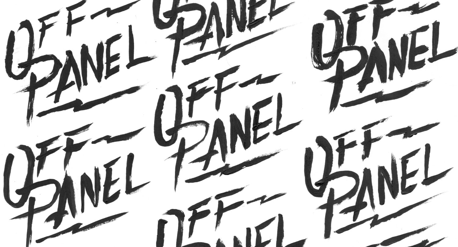
He brought some ideas, and we talked about what made Off Panel different from the others…

Original Logo
New Direction

“Off Panel is an interview show that gets the story behind the things and creators we love, focusing mostly on comics but also touches on journalism, sports and more.” 

So as the name suggests, it’s not so much focused on what happens on the page, but the influences surrounding it. Since this is like a behind the scene conversation that can go anywhere, I thought that maybe a hand-drawn execution might help convey something less structured and looser. I looked towards some of the indie comics and hand-drawn logos for examples that were a little more free-form and rough around the edges. I also considered using a fun and bright color palette, sticking to the CMYK of traditional printed comic. I wanted to go deep into the show’s lore and illustrate some unique moments… ya know, add some easter eggs for the fans. I absolutely fell in love with this idea and thought this was the sure way to go, even though it meant more work for me.

Mood board

We had a little chat and David was, let’s say luke-warm to this direction. We brainstormed a little, and soon I found out that I was probably forcing it a bit. So I shut my mouth and started to listen…

“I do like the idea of a more hand-drawn, sketchy type logo. I’m less into the collage background idea, as I tend to prefer cleaner logos. I did like the idea of a more space-y, less specific type background. I’m just a bit nervous about making it too comic book-y, as I want it to be reflective of that world but not obsessed with it. Here are some comics whose logos/design I dig: Extremity – my current fave, Blacksad, and The Wicked + The Divine (really love the simplicity of this font).”

– David Harper

After our conversation, I reviewed everything we developed, and I reminded myself that this was a logo project. So let’s focus on the logo, then develop supporting elements after. I started sketching…

A few directions rose to the top…

Option two was the clear winner. Now it needed some supporting elements to make it pop and add a little more content. Maybe something in the realm that implies a sort of off-script, sci-fi, fantasy, exploration with a nostalgic feel.

The final product…

Some of the hand-drawn prelims.

Dude loved it! And I was pretty happy with the outcome. Be sure to subscribe and give it a listen: Off Panel