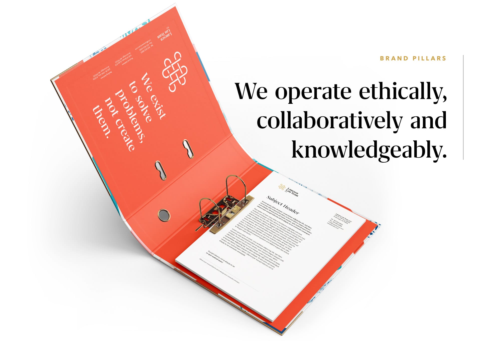
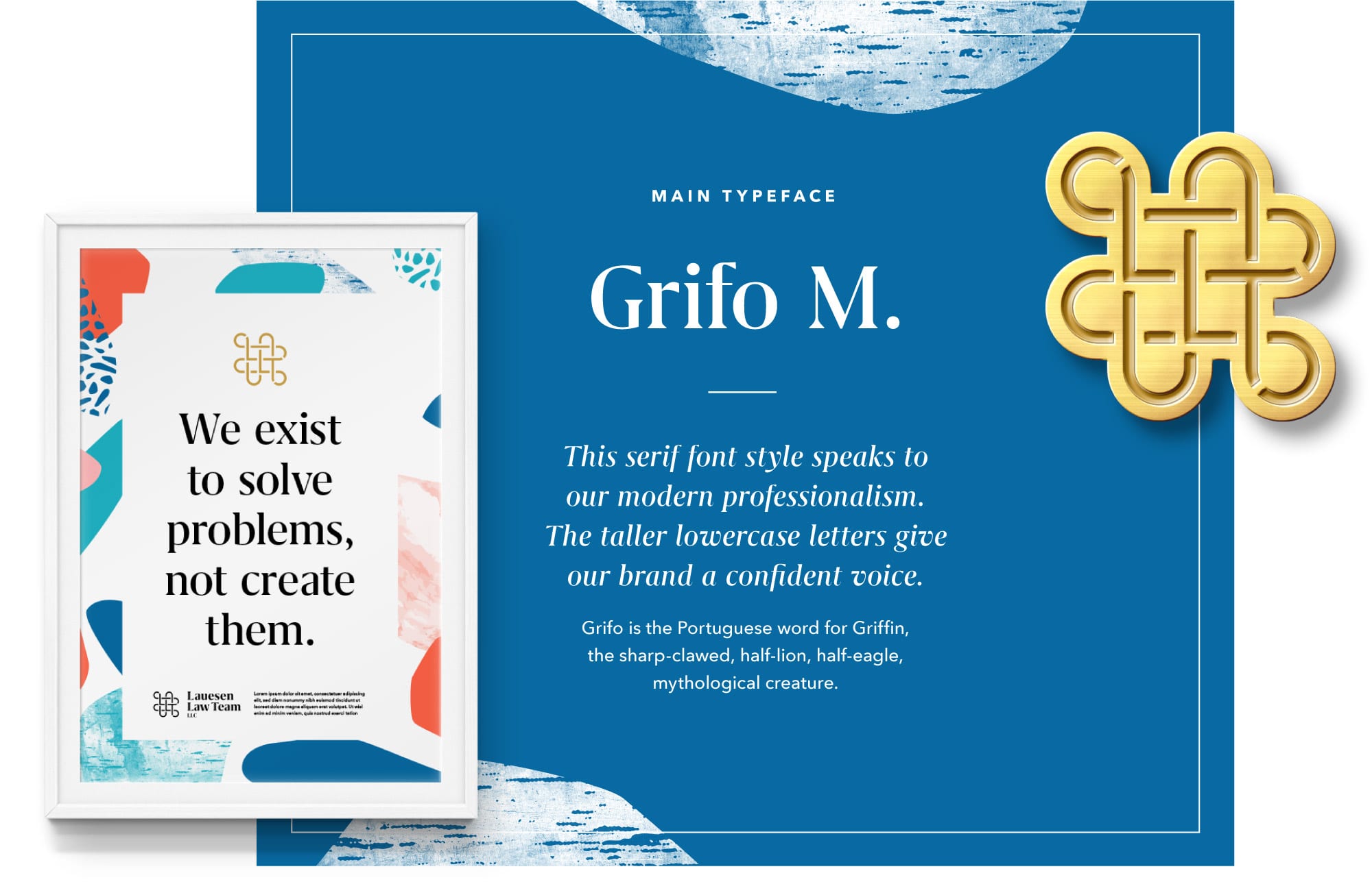
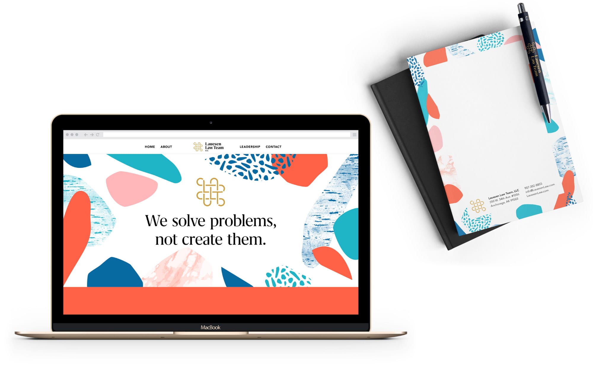
The Lauesen Law Team was born out of the need to serve justice in an industry with a less than moral reputation. Their mission is to collaborate openly as a team, guided by a high standard of ethics, compassion, and straightforward representation. They work together with their clients to identify the problem and educate them on every option and the associated risks and rewards. If you’ve ever needed representation, you’re already under a lot of stress. The Lauesen Law Team exists to solve problems, not create them.
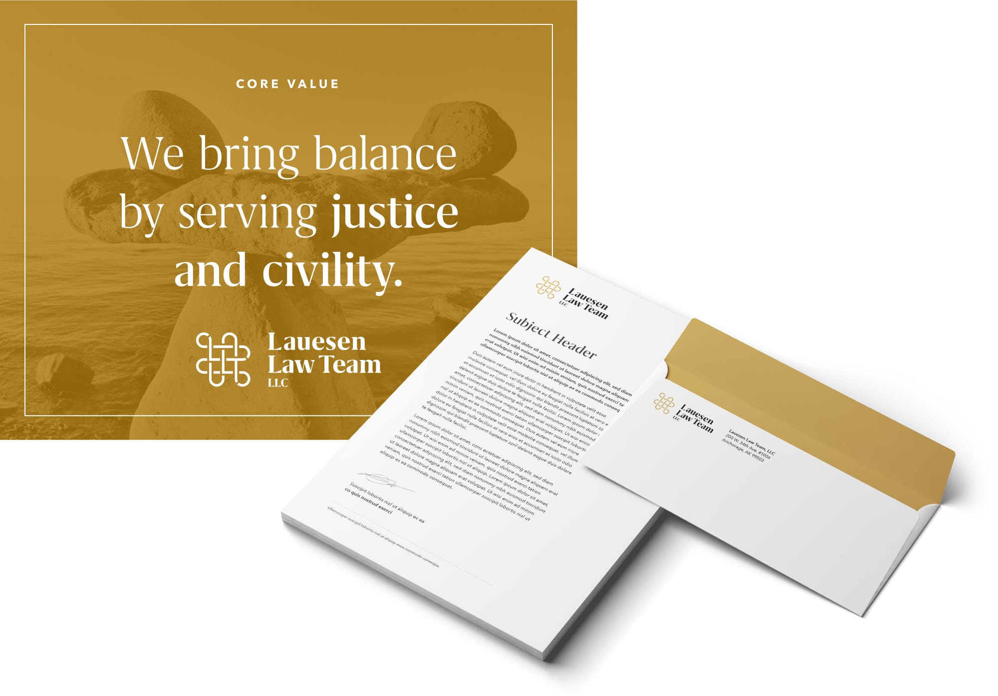
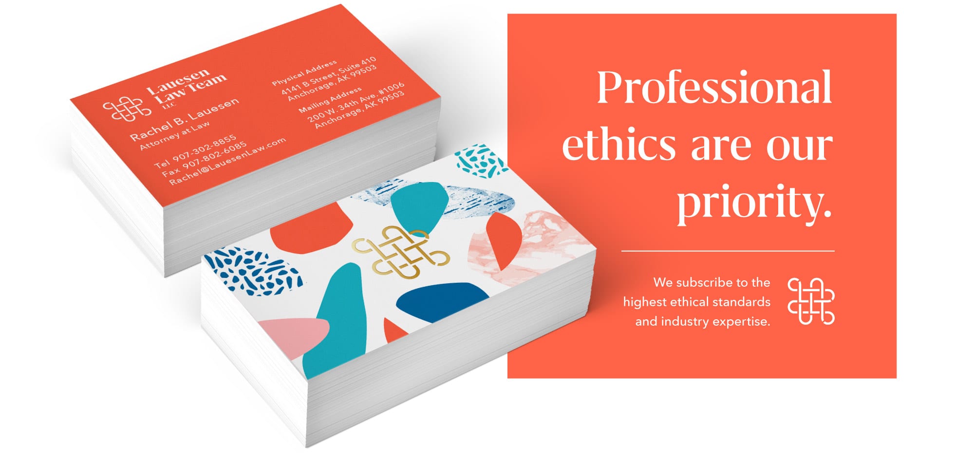
The Lauesen Law Team is in the business of serving justice & civility at the highest ethical standards. Being a progressive and female-owned business, their brand communicates that they are not the traditional, stuffy old law firm.


Credits:
Northern Printing, Printer