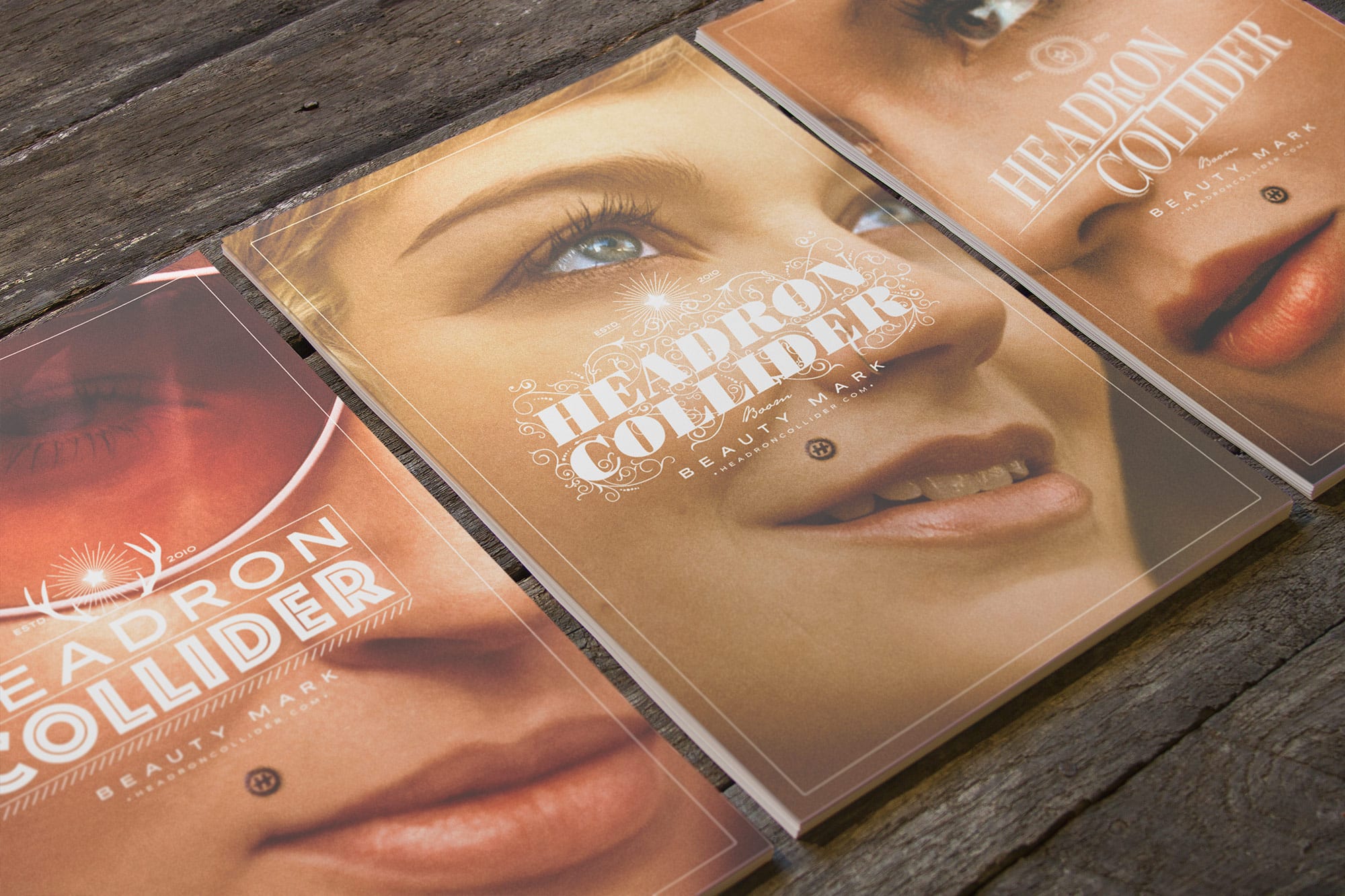
So this blog was mainly created to serve as a place of visual inspirations. After a few months of seeing such great artists/creators and their impeccable craftsmanship, it’s hard not to be inspired. I’ve recently created a self-promotional poster series that focuses on the idea of brand identification and beauty. I’m not exactly sure where the overall idea came from. I think it may have been an inspiration from the film Exit Through The Gift Shop with the Mr. Brainwash “Marilyn” prints. The beauty mark stood out to me and raised the question: “why is that considered beautiful”?
The style of execution, however, came from different places… I was super inspired by an earlier post on vintage photography. I knew then that stock images weren’t an option and enlisted the help of three friends that graciously posed for the project. The use of reversed out type was so well done in the Live The Language video series by Albin Holmqvist, I had to experiment with a similar execution.
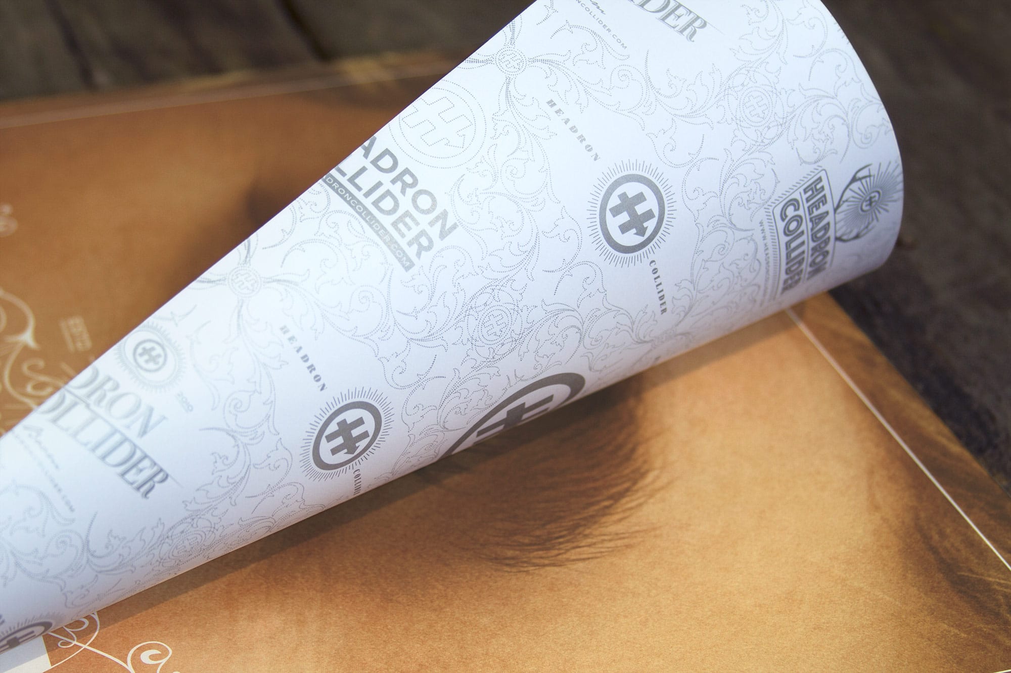
The posters are 16 X 24, 4-color offset printing on 65# cougar, with a one color silver Pantone on the back.
See more