The Big One 2016 pt. 1

As far as having fun on a project; this one sits firmly at the top. I got to make an animal-human hybrid in Air Force 1s with tattoos and a spiked bat. What’s more fun than that!? It was a huge learning experience that I had to write about it.

I was so fortunate to be asked by AIGA Alaska to work on the promo material for The BIG One. It had the potential to be really really cool, so of course, I said yes. I mean, this was for a creative group of people, so I could flex a little creative muscle and get a bit weird. But the thing that made it cool, also made it intimidating. When you’re designing something for graphic designers, it has to be tight. I knew this was going to be looked at under a microscope. It just comes with the territory.

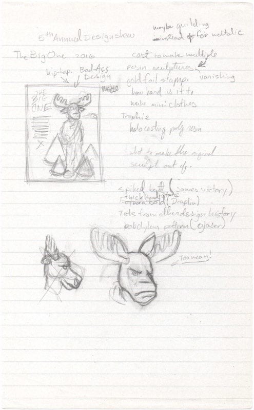
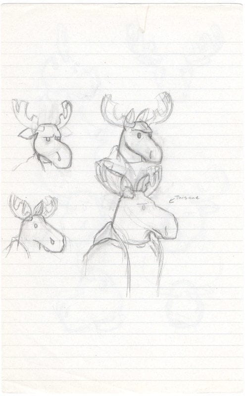
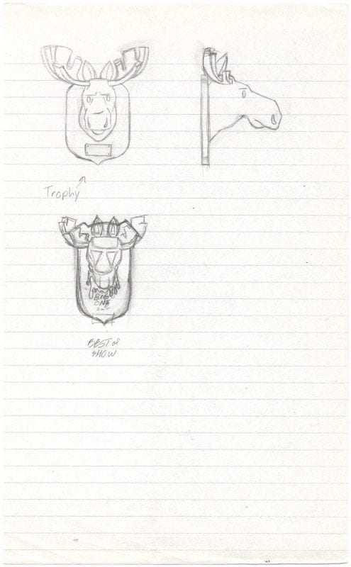
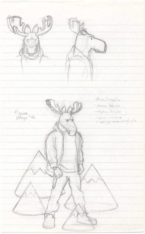
My first thought was, “This has to be different. This has to be something that no one has ever done for this event.” I immediately thought of doing something three-dimensional and getting away from the traditional flat print design. And personally, I was getting really bored with that, and starting to feel stuck in a rut. So something three-dimensional, but what exactly? I knew that the Best of Show won a sweet trophy at the end of the night. So what if I built a really elaborate, mix-media trophy and used that as the main artwork? Could be cool right? But what exactly would it be?

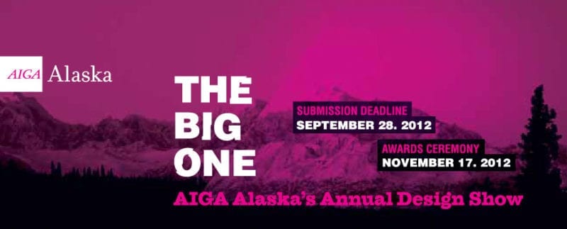
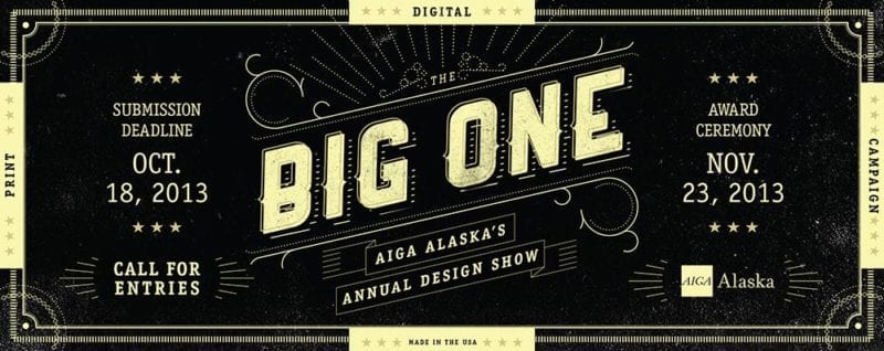
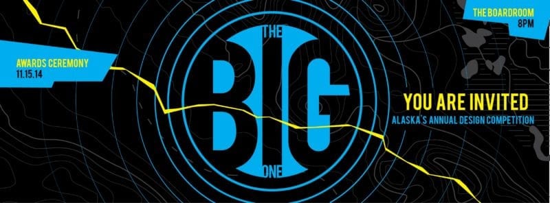
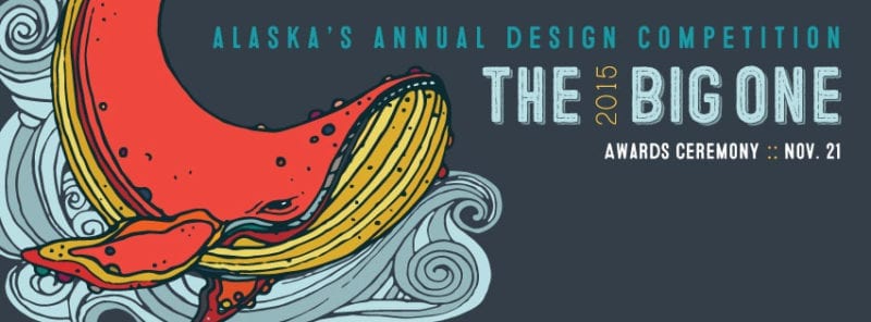
I took a gander at the past events to source some ideas…

2012 by Sini Salminen
2013 by Spawn Ideas
2014 by Solstice Advertising
2015 by Corso Graphics

One thing these all had in common was the reference to size – a whale, Denali, the big earthquake of ’64, and big bold type. It plays well with the title and could introduce an interesting visual.

I thought it would be good to show some Alaska pride. Let’s take a symbol of Alaska and make it larger than life. Immediately I’m thinking ‘moose’. I’m always awe stricken when I see one strolling down the sidewalk.

It was right around this time I came across the work of Hidden FooCoolrain, and Kiddo. I was amazed and envious of their craftsmanship and the fact that it didn’t look like work. It looked like fun. Ever since then I wanted to give it a shot. Maybe this project was my chance.

The concept is starting to evolve and pick up steam. Instead of just a moose, what about a larger than life moose-man as the symbol of Alaska? That’s interesting. Next thing: how do we make it say AIGA? Let’s just deck him out in AIGA design references. Better yet, let’s reference the AIGA speakers who visited the state. I chose six speakers: Aaron DraplinJames VictoreJessica HischeDebbie MillmanStefan Bucher, and Marc English.

Select pieces from AIGA designers that were used as inspiration for the artwork.

With no idea of how I would pull this off, I started sketching…

I found that personality was going to play an important part. The only thing that came to mind was “bad-ass rebel.”  Why not? This is the last frontier. It takes a special type of attitude to venture up to these parts.

Having a big game trophy as the Best of Show award seemed to fit perfectly with the narrative. The big winner of the night caught and mounted “The Big One.” It’s a little weird, somewhat sadistic and shocking, but that’s what I liked about it. In some of the earlier sketches, I played with the idea of gold blood dripping from the neck.

I can’t believe they actually signed off on this! Now I had to find a way to pull it off…

Continue reading in the next post.