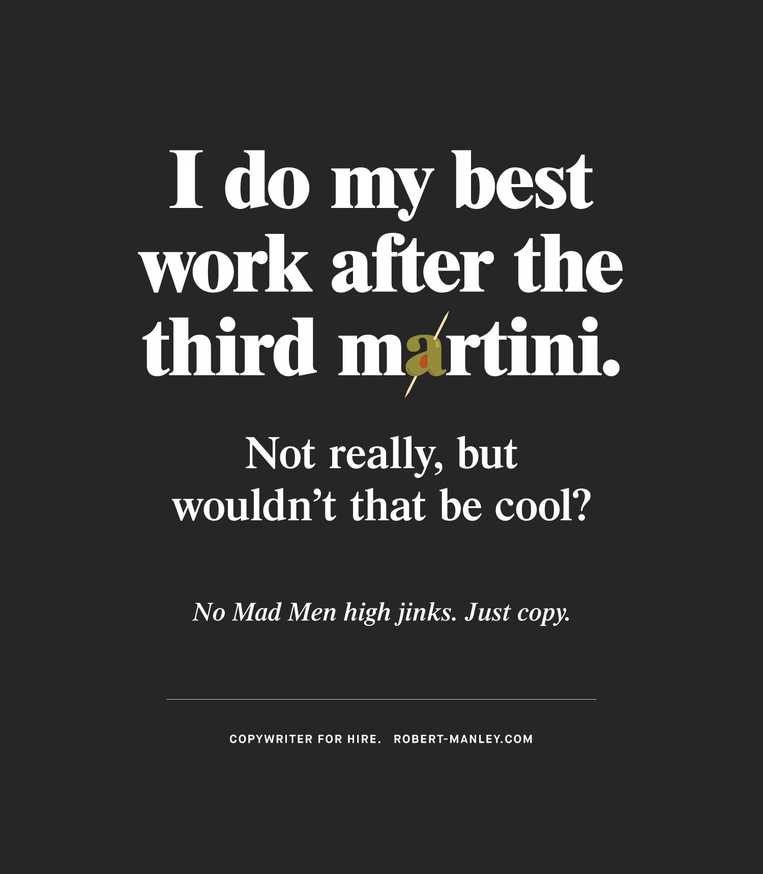
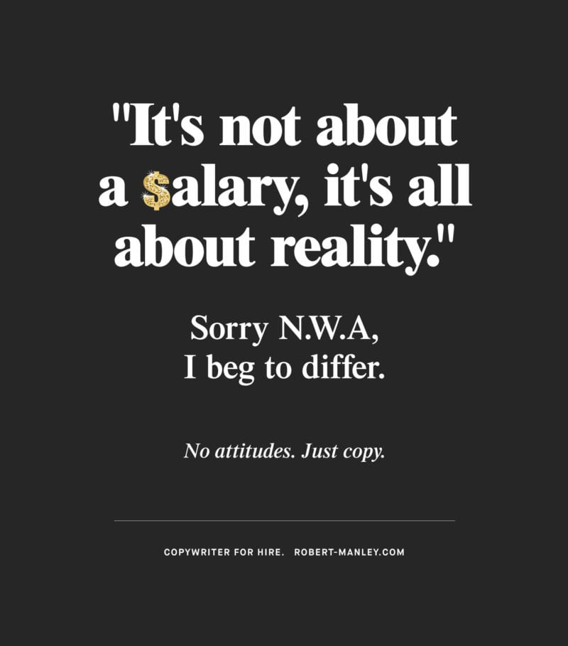
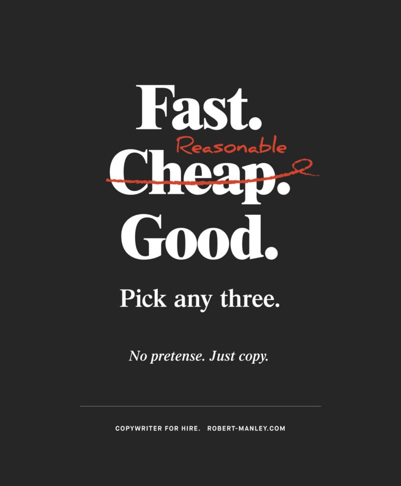
The main objective was to promote great writing. Naturally, we thought that all the focus should be on the copy. I felt the type style should capture the personality/writing style of the author. It’s classic, bold and harkens back to that age of advertising where a good line says it all.
There’s always a great amount of personal admiration and a little jealousy, whenever I read a great line of copy. So, I jumped at the opportunity to work on this self-promotional project with the talented writer, Robert Manley.

Credits:
Collaboration with Robert Manley.